> ## Documentation Index
> Fetch the complete documentation index at: https://docs.theoptimizer.io/llms.txt
> Use this file to discover all available pages before exploring further.
# Build a report
> Choose the network, breakdown and grouping, filter the rows, set the date range and currency, then chart, customize and export the result.
Every report is built from the same toolbar, read from left to right: **network**, **breakdown**, **group by**, **currency**, **filters**, and the **date range** on the right. The chart and the table below it update as soon as you change any of them.
 ***
## Network
Choose **All networks** to report across every connected ad network at once, or pick a single network to report on it alone.
A single network unlocks that network's own levels — ad sets, ads, sites, widgets and so on — as breakdowns. **All networks** keeps to what every network has in common: ad networks, ad accounts, campaigns and time.
Changing the network resets the breakdown to its starting point: **Ad network** for all networks, **Ad account** for a single one.
***
## Breakdown
The breakdown decides what each row of the report is.
| Breakdown | Each row is | Available with |
| ---------------------------- | ----------------------------------------------------------------------------------- | -------------------------------- |
| **Ad network** | One ad network | All networks |
| **Ad account** | One ad account | All networks and single networks |
| **Campaign** | One campaign | All networks and single networks |
| **The network's own levels** | An ad set, an ad, a site, a widget and so on, named the way that network names them | Single networks |
| **Day** | One day of the date range | All networks and single networks |
| **Month** | One month of the date range | All networks and single networks |
***
## Network
Choose **All networks** to report across every connected ad network at once, or pick a single network to report on it alone.
A single network unlocks that network's own levels — ad sets, ads, sites, widgets and so on — as breakdowns. **All networks** keeps to what every network has in common: ad networks, ad accounts, campaigns and time.
Changing the network resets the breakdown to its starting point: **Ad network** for all networks, **Ad account** for a single one.
***
## Breakdown
The breakdown decides what each row of the report is.
| Breakdown | Each row is | Available with |
| ---------------------------- | ----------------------------------------------------------------------------------- | -------------------------------- |
| **Ad network** | One ad network | All networks |
| **Ad account** | One ad account | All networks and single networks |
| **Campaign** | One campaign | All networks and single networks |
| **The network's own levels** | An ad set, an ad, a site, a widget and so on, named the way that network names them | Single networks |
| **Day** | One day of the date range | All networks and single networks |
| **Month** | One month of the date range | All networks and single networks |
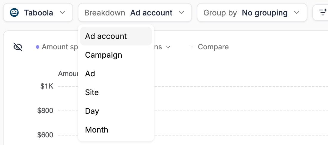 To see how a native campaign performs site by site, pick the network, choose the **Campaign** breakdown, then group by the network's placement level (for example **Site** on Taboola). See [Group by placement](/reports/grouping#group-by-placement).
***
## Group by
Grouping buckets the rows into expandable groups, each with its own subtotal. The options depend on the breakdown — for example, you can group campaigns by **Ad account**, **Status** or **Tag**, or group days by **Ad account** to get one daily trend per account.
Grouping has its own page: [Group rows](/reports/grouping).
***
## Filters
Click **Add filter** to open the filter bar under the toolbar, then type in **Filter or search…** to add conditions. It's the same filter builder you use in the Campaign Manager — see [Navigation and filtering](/campaign-manager/navigation-and-filtering) for how conditions work. Click **Done** to close it.
Active filters appear as chips on the toolbar next to the **Filters** button, which shows how many there are. Click a chip to edit the filters, or click its **×** to remove it. When there are more chips than fit, **+N** stands in for the rest.
***
## Date range
Use the date picker on the right of the toolbar to set the period the report covers. When you save a report with a relative range such as *Last 14 days*, it stays relative — the report always shows the latest 14 days when you open it. A custom range stays fixed to the dates you picked.
***
## Currency
If your ad accounts and connected trackers use more than one currency, a currency control appears on the toolbar and reads **Mixed**. Pick a currency to convert every spend and revenue amount in the report into it, at the latest exchange rate. Pick **Original currencies** to go back to each account's own currency.
The control only lists the currencies your own accounts and trackers use. If everything you have is in one currency, it doesn't appear at all. See [Multiple currencies](/campaign-manager/multiple-currencies) for how currencies work elsewhere in TheOptimizer.
***
## The chart
The chart sits above the table and compares the rows you pick.
To see how a native campaign performs site by site, pick the network, choose the **Campaign** breakdown, then group by the network's placement level (for example **Site** on Taboola). See [Group by placement](/reports/grouping#group-by-placement).
***
## Group by
Grouping buckets the rows into expandable groups, each with its own subtotal. The options depend on the breakdown — for example, you can group campaigns by **Ad account**, **Status** or **Tag**, or group days by **Ad account** to get one daily trend per account.
Grouping has its own page: [Group rows](/reports/grouping).
***
## Filters
Click **Add filter** to open the filter bar under the toolbar, then type in **Filter or search…** to add conditions. It's the same filter builder you use in the Campaign Manager — see [Navigation and filtering](/campaign-manager/navigation-and-filtering) for how conditions work. Click **Done** to close it.
Active filters appear as chips on the toolbar next to the **Filters** button, which shows how many there are. Click a chip to edit the filters, or click its **×** to remove it. When there are more chips than fit, **+N** stands in for the rest.
***
## Date range
Use the date picker on the right of the toolbar to set the period the report covers. When you save a report with a relative range such as *Last 14 days*, it stays relative — the report always shows the latest 14 days when you open it. A custom range stays fixed to the dates you picked.
***
## Currency
If your ad accounts and connected trackers use more than one currency, a currency control appears on the toolbar and reads **Mixed**. Pick a currency to convert every spend and revenue amount in the report into it, at the latest exchange rate. Pick **Original currencies** to go back to each account's own currency.
The control only lists the currencies your own accounts and trackers use. If everything you have is in one currency, it doesn't appear at all. See [Multiple currencies](/campaign-manager/multiple-currencies) for how currencies work elsewhere in TheOptimizer.
***
## The chart
The chart sits above the table and compares the rows you pick.
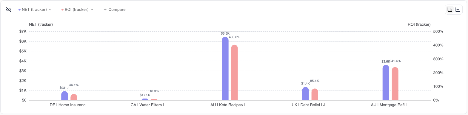 * **Pick rows** — tick the checkbox on a table row to add it to the chart. The first five rows are picked for you when the report loads, and you can chart up to five at a time
* **Pick metrics** — click a metric chip at the top of the chart to swap it for another metric, and **+ Compare** to add one. You can also click the circle in a metric's column header: it turns into the metric's number on the chart. New reports start with **Amount spent** and **Impressions**
* **Bar chart** — the default, picked with the icons at the top-right of the chart. Compares the picked rows side by side, with up to four metrics
* **Line chart** — plots each picked row day by day across the date range, with up to two metrics
* **Hide the chart** — click the eye icon at the top-left of the chart to collapse it and give the table more room. Click **Show chart** to bring it back
With a **Day** or **Month** breakdown, the chart plots the rows along a time axis instead.
***
## The table
The table shows one row per breakdown item — or one row per group, when a grouping is active — with a pinned **Net Results** row carrying the totals.
* **Sort** — click a column header to sort by it, and again to reverse the order
* **Expand groups** — click the arrow on a group row to show the rows inside it
* **Ad previews** — at ad level, rows and chart labels show the ad's thumbnail. Hover a thumbnail in the table to preview the full ad
* **Pick rows** — tick the checkbox on a table row to add it to the chart. The first five rows are picked for you when the report loads, and you can chart up to five at a time
* **Pick metrics** — click a metric chip at the top of the chart to swap it for another metric, and **+ Compare** to add one. You can also click the circle in a metric's column header: it turns into the metric's number on the chart. New reports start with **Amount spent** and **Impressions**
* **Bar chart** — the default, picked with the icons at the top-right of the chart. Compares the picked rows side by side, with up to four metrics
* **Line chart** — plots each picked row day by day across the date range, with up to two metrics
* **Hide the chart** — click the eye icon at the top-left of the chart to collapse it and give the table more room. Click **Show chart** to bring it back
With a **Day** or **Month** breakdown, the chart plots the rows along a time axis instead.
***
## The table
The table shows one row per breakdown item — or one row per group, when a grouping is active — with a pinned **Net Results** row carrying the totals.
* **Sort** — click a column header to sort by it, and again to reverse the order
* **Expand groups** — click the arrow on a group row to show the rows inside it
* **Ad previews** — at ad level, rows and chart labels show the ad's thumbnail. Hover a thumbnail in the table to preview the full ad
 The table footer holds three more controls.
### Columns
Click **Columns** to choose which metrics appear and in what order. Metrics are grouped into **Traffic Source Metrics**, **Tracker Metrics** and **Custom Metrics** — tick the ones you want, drag them into order under **Columns Order**, then click **Apply**. The choice is saved with the report, and any [custom metrics](/campaign-manager/custom-metrics) you've defined are available here too.
### Heatmap
**Heatmap** shades every value that sits above its column's average — the further above, the stronger the shade — so outliers stand out at a glance. It starts on **Emerald**. Choose another color (**Sky**, **Amber** or **Violet**), or **Off** to turn it off.
The heatmap color is remembered in your browser and applies to every report you open there. It isn't saved with a report.
### Export
Click **Export**, choose **CSV (.csv)** or **Excel (.xlsx)**, then click **Export** again. The dialog shows how many rows the file will contain, and the file lands in your browser's downloads folder. You can also export from the arrow next to the **Save** button, under **Export…**.
The table footer holds three more controls.
### Columns
Click **Columns** to choose which metrics appear and in what order. Metrics are grouped into **Traffic Source Metrics**, **Tracker Metrics** and **Custom Metrics** — tick the ones you want, drag them into order under **Columns Order**, then click **Apply**. The choice is saved with the report, and any [custom metrics](/campaign-manager/custom-metrics) you've defined are available here too.
### Heatmap
**Heatmap** shades every value that sits above its column's average — the further above, the stronger the shade — so outliers stand out at a glance. It starts on **Emerald**. Choose another color (**Sky**, **Amber** or **Violet**), or **Off** to turn it off.
The heatmap color is remembered in your browser and applies to every report you open there. It isn't saved with a report.
### Export
Click **Export**, choose **CSV (.csv)** or **Excel (.xlsx)**, then click **Export** again. The dialog shows how many rows the file will contain, and the file lands in your browser's downloads folder. You can also export from the arrow next to the **Save** button, under **Export…**.
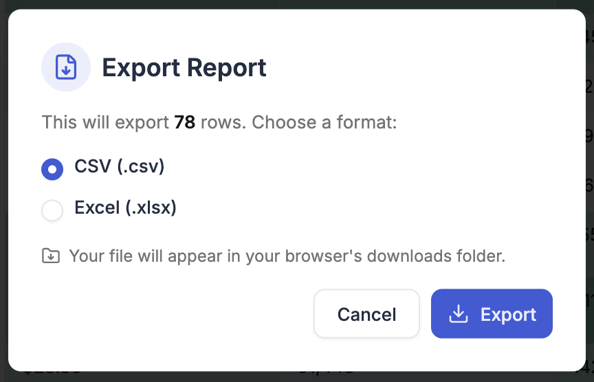 The export contains what the table shows at the top level — the group rows when a grouping is active, otherwise the breakdown rows — in the table's current sort order, with the columns you have visible and a final **Net Results** row.
***
## Related
Group by tags, ad account attributes, or your own custom groups.
Save what you've built and come back to it later.
The export contains what the table shows at the top level — the group rows when a grouping is active, otherwise the breakdown rows — in the table's current sort order, with the columns you have visible and a final **Net Results** row.
***
## Related
Group by tags, ad account attributes, or your own custom groups.
Save what you've built and come back to it later.